Venmo Redesign 💸
UI/UX
2 daysPersonal Project
Project Overview
Throughout my time in college, Venmo has been an integral part of my social interactions. Its functionality made peer-to-peer payments easy and alleviated the awkwardness of asking for money. However, its interface has also caused a fair share of accidental payments and requests. With my time in college coming to a close I wanted to reflect back on Venmo, talk to other users of the app, and find ways to improve the user experience.
Guiding Goals
This project was a 2 day design sprint. My goal was to iterate quickly while continuing to validate my designs with user testing. I focused on clarifying the pay and request actions, streamlining the UI, and adding a group feature for users to more easily split payments.
Research

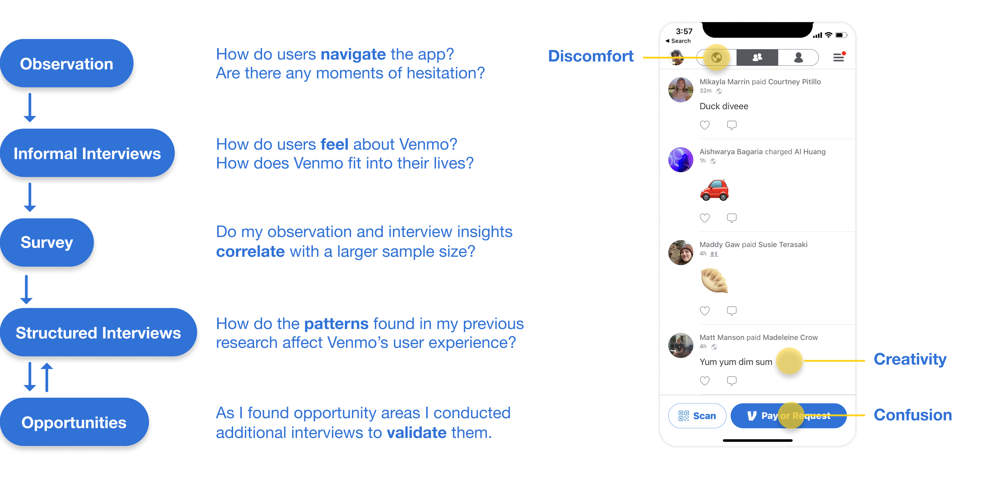
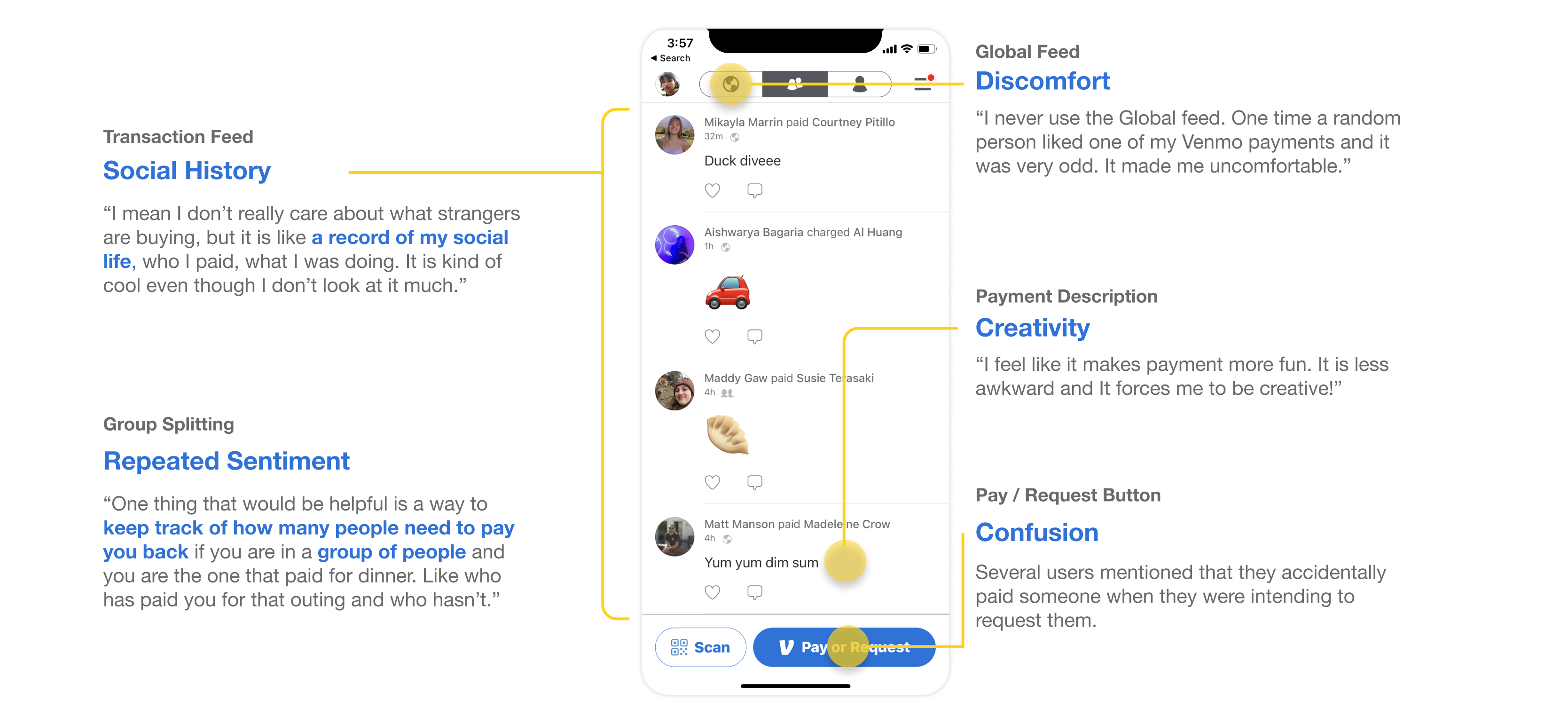
User Interviews


I validated these insights through a survey and an additional round of interviews:
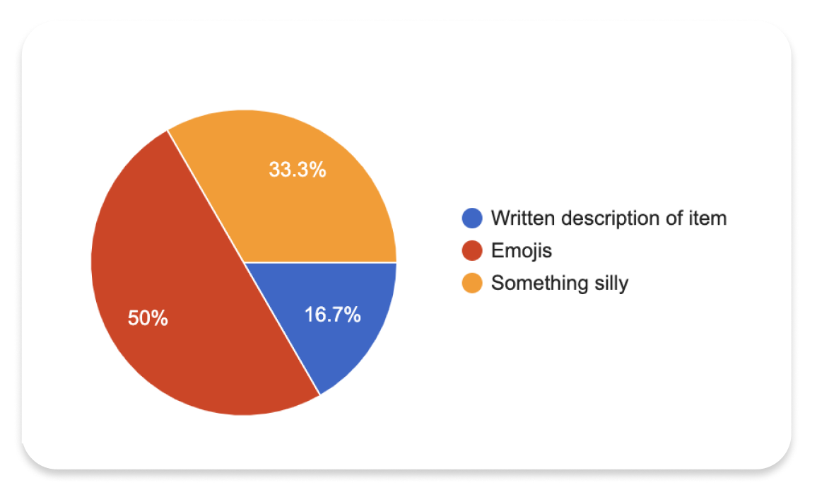
In the survey results, I found that most people used the description to be silly or place emojis. I also found that only 1 / 12 people ever looked at the global feed and that it made most people uncomfortable.
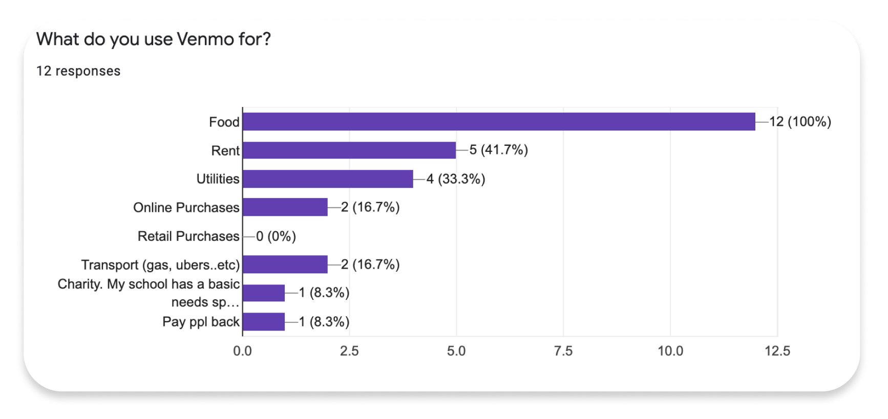
I also gathered data on what kinds of purchases people mainly used Venmo for. This prompted me to explore whether people would be interested in gaining a better picture of not only who they were paying but also what they were paying for.
Opportunities
Pay and Request
Often users would start a transaction intending to request payment from a friend but accidentally pay them that amount instead.
Group Splitting
Requesting multiple people for payments was difficult and many users didn’t know that it was even possible through Venmo.
Privacy
Privacy was a concern and some people were not aware of Venmo’s automatic public privacy setting.
Data and Recap
Something unique about Venmo is how it highlights the social aspect of transactions. However, its feed and monthly recap did little to highlight what users cared about.