HESTIA 🔥
UI/UX
1.5 weeksPersonal Project
Project Overview
As Wildfires ravaged the Bay area the summer of 2020, I found myself having to visit 5 -7 different sources in order to figure out what was going on. The information my family and I wanted was simple, but it was near impossible to find it. In this short exploration I wanted to design an app that aggregates real time information about wildfires so that users can stay informed without having to visit multiple sources.
Guiding Goals
My primary goal when designing this app was to provide essential information in a way that was customizable and not overwhelming for the user.
Interview Insights
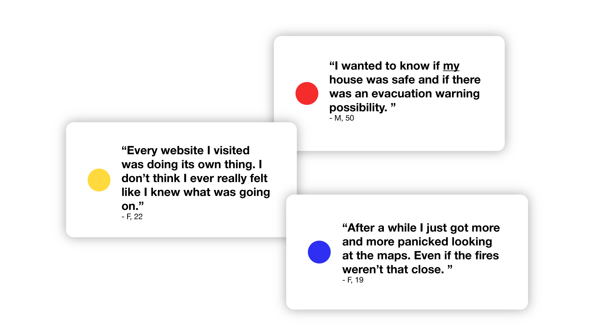
I spoke to several people who, like me, were close to the fires during the summer of 2020. One thought that was repeated across several conversations was that the inconsistency of information provided by local authorities and other fire tracking websites made it difficult to understand the situation.
🔴 Tailor information for user
🟡 Clear graphics are essential
🔵 Avoid sensational or panic inducing statistics -unless they apply to the user specifically.


Research Insights
When researching the current resources used by my interviewees and others in CA, I found that the maps were difficult to read, dense with information, and did not provide additional contexts like wind patterns or evacuation routes.
People generally liked to see the progress on containment for fires, but they were more concerned with the fires closest to them.
This round of investigation reiterated that it was vital for information to be tailored to the user and that fire boundaries and contextual information like wind, highways, and evacuation specifics should be viewable in conjunction.