There are 3 primary pages that users move through

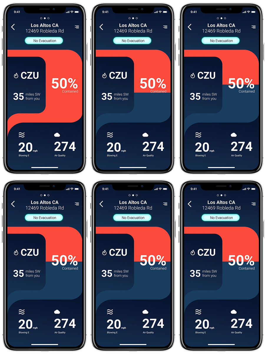
The Locations page allows users to save locations of interest and see information pertinent to each address.
The Summary page offers critical information at a glance. This gives the user what they need to know without overwhelming them.
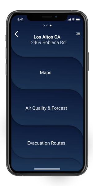
The menu page allows users to access more detailed information relevant to their chosen address.
Maps & Forecasts
More detailed information like forecasts and maps can be accessed from points on the summary page or from the menu page. This ensures a hierarchy of information and lets users decide how much information they would like to engage with.
Forecast
Forecast
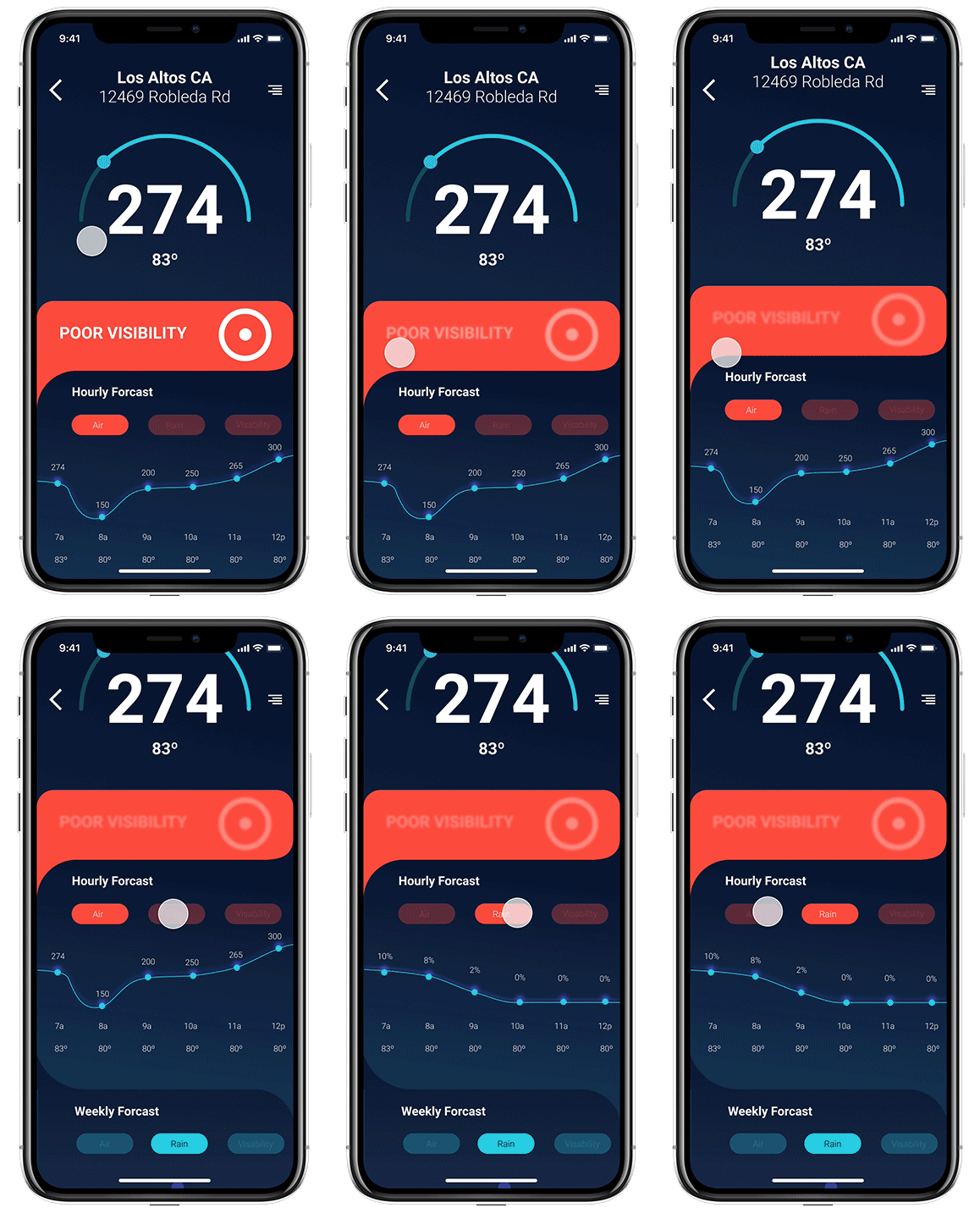
At a glance it is easier to understand graphic information than lists of numbers or data points. With this in mind, I created visualizations of both hourly and weekly weather events so that users can quickly understand the pattern of air quality, rain, and temperature throughout the day or week
Map - Screens
Map Views
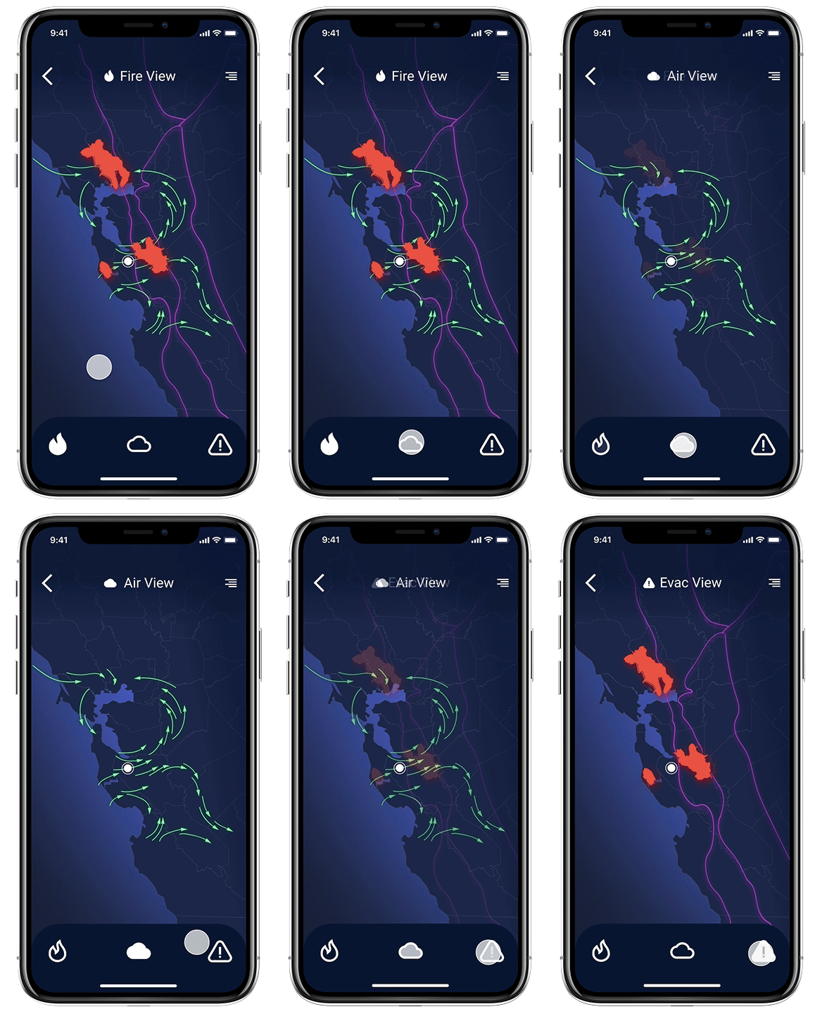
1. Fire
1. Fire
2. Air
3. Evacuation.
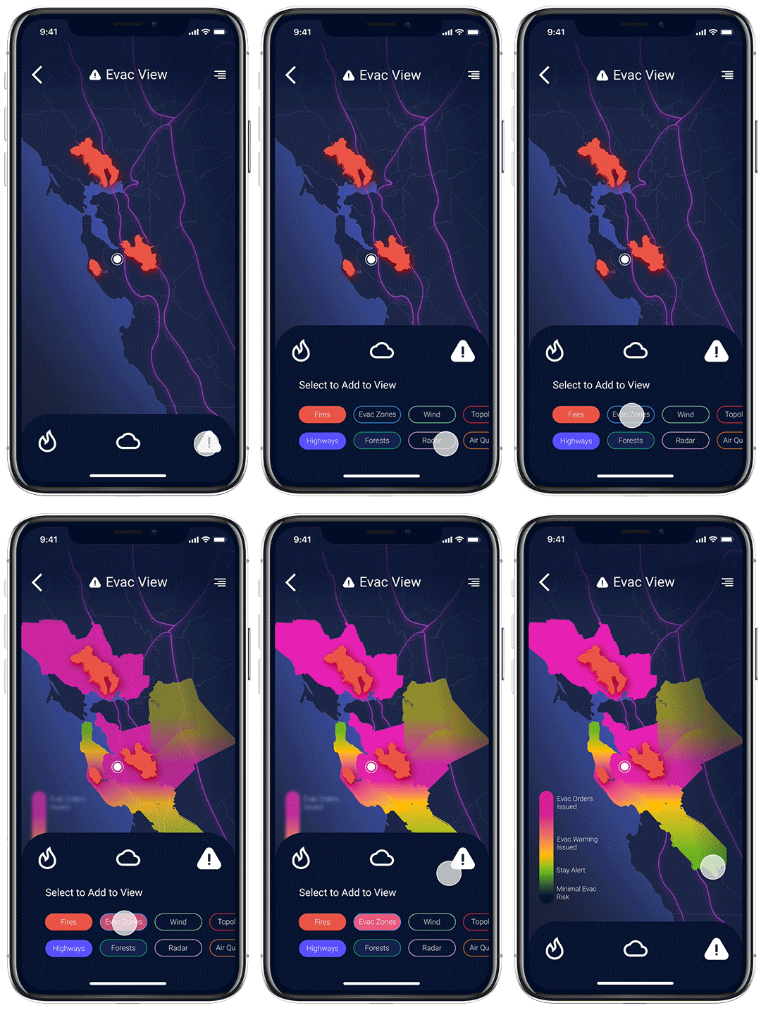
Maps - Add to View
Maps customization
Each view can be customized to show multiple kinds of information. This allows users to see information in context.
Wind patterns can help users understand how likely it is that a fire will travel in their direction, while topology informs users of where protective ridges are located. This kind of context allows for deeper understanding.
These maps are only the beginning. I hope to continue this project and create more detailed views and interactive information. I also think there is room to explore new ways of visualizing weather and geographic data that might add additional value to these views.